
Super fact 44 : Sulfur dioxide pollution in the US has fallen by approximately 95% since the 1970s. This significant reduction is primarily due to regulations like the Clean Air Act. Global sulfur dioxide pollution has also fallen but not as much.
Sulfur dioxide is a colorless gas with the formula SO2. It has a pungent smell, which you notice after using matches. It is released naturally by volcanic activity and is produced as a by-product of burning sulfur-bearing fossil fuels and from metals refining. Sulfur dioxide is somewhat toxic to humans and by reacting with water it creates acid rain, which is a serious environmental problem.
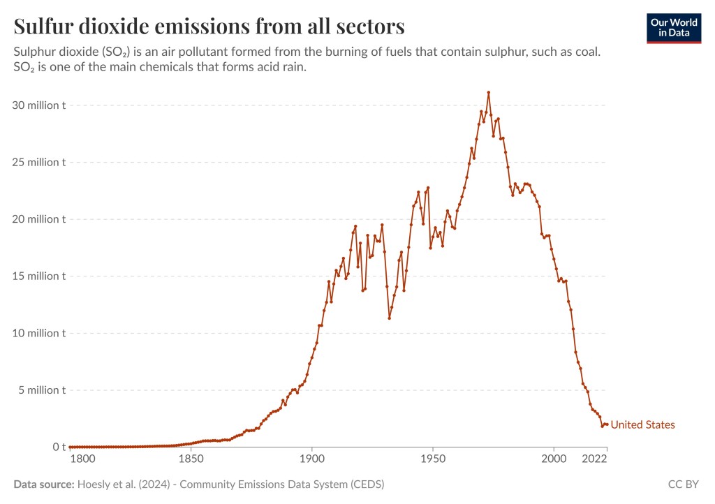
The good news is that the Clean Air Act has driven technological advancements and the adoption of cleaner practices in industries that produce sulfur dioxide emissions. This has resulted in a drop of sulfur dioxide pollution in the US by 95% according to EPA and Statista and 94% according to Our World In Data. Statista is a pay site, so I am not going to link to it. Below is a graph from Our World In Data showing the reduction in sulfur dioxide pollution in the US.
I should mention that by clicking this link you can visit the graph above Our World in Data and select different countries and regions and play around with the settings.
Sulfur Dioxide Emissions Worldwide
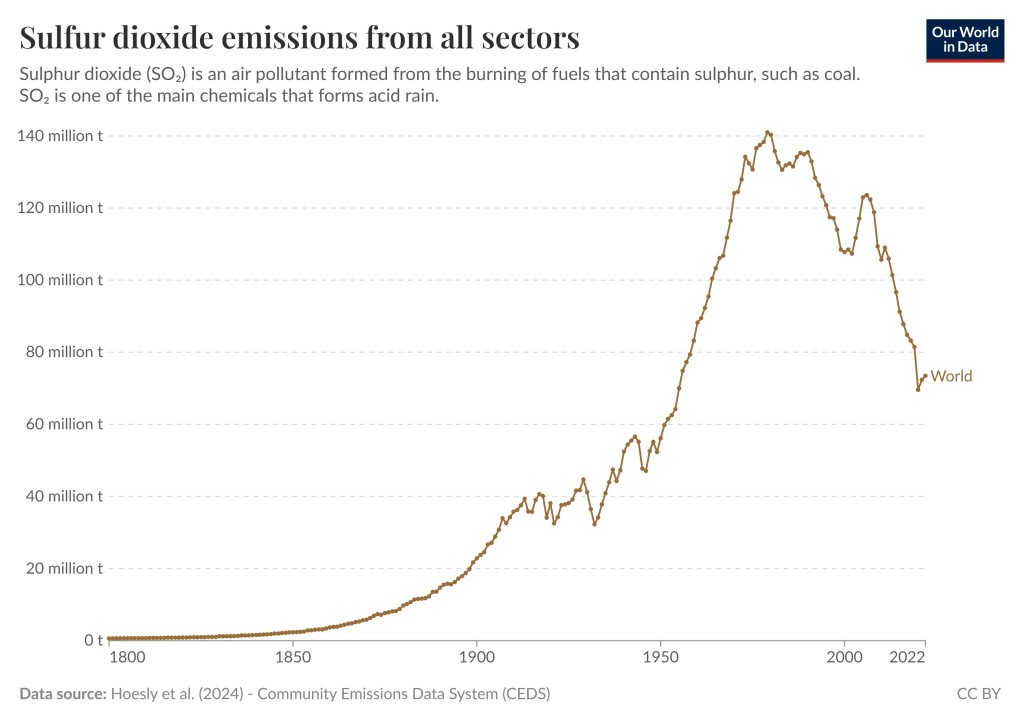
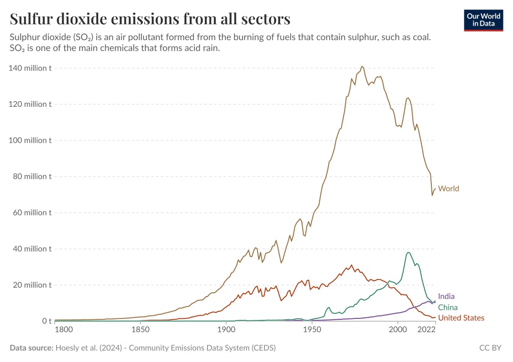
The worldwide emissions peaked in 1979 and fell sharply after that even though the progress (reduction in sulfur dioxide emissions) has not been as spectacular as in the US. Worldwide reductions are around 48%. Again, by visiting the Our World In Data page you can play around with the graph and the settings and view different countries and regions. This is an additional source visualizing the data.
Good News with Respect to Pollution
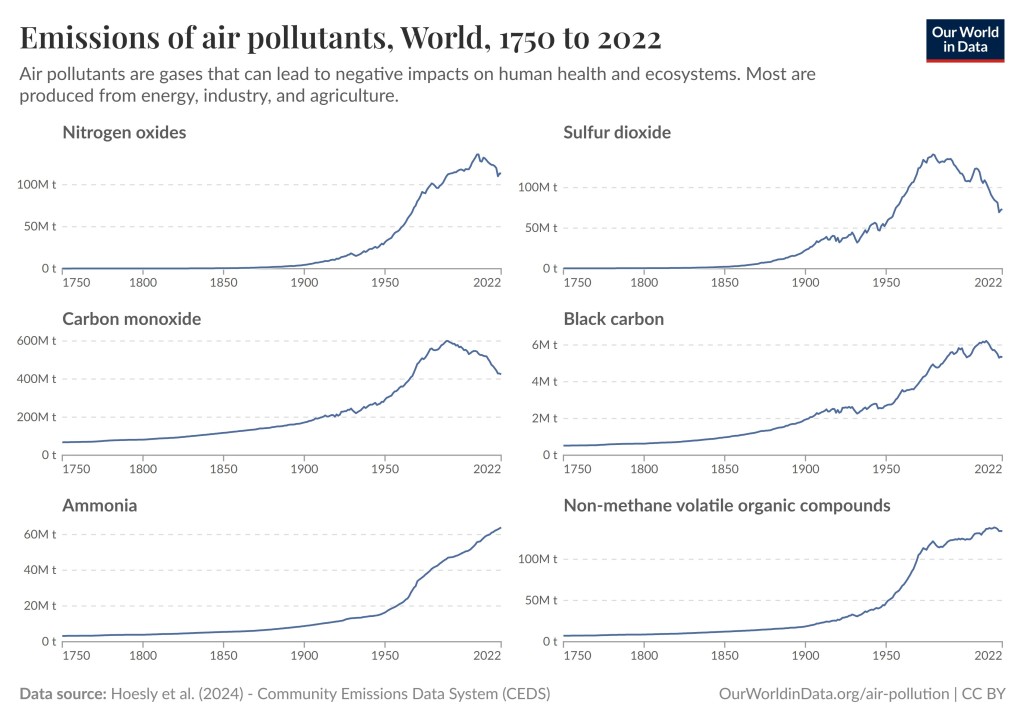
Sulfur dioxide emissions have gone down worldwide, which is good news. However, sulfur dioxide is not the only pollutant that we have succeeded in reducing. The graph below demonstrates that the US has also made great progress in reducing Nitrogen Oxides pollution, Carbon Monoxide, Black Carbon, and Non-methane volatile organic compounds. We have not been as successful with reducing Ammonia pollution. However, according to Google AI sulfur dioxide, followed by Nitrogen Oxides pollution, Carbon Monoxide, and Black Carbon are the most serious pollutants. The graph below is taken from this page in Our World in Data.

The graphs for the world do not look as impressive. However, even in this case it looks like some progress has been made. Four graphs have peaked and are turning downwards, and one graph has flattened but unfortunately the graph for ammonia pollution is still heading upwards. It should be noted that these pollutants are more or less local in the sense that they affect the polluting country and/or surrounding countries the most, whilst the climate change / global warming effect from carbon dioxide and other long lasting greenhouse gases tend to affect the entire planet.
Aside from the success in reducing these pollutants there is more good news.
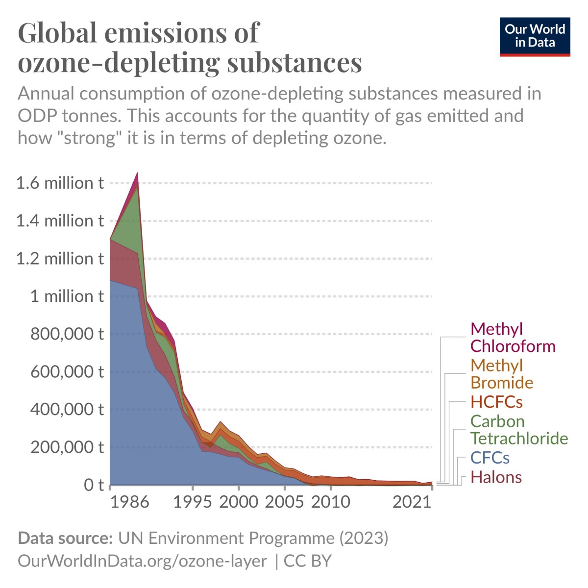
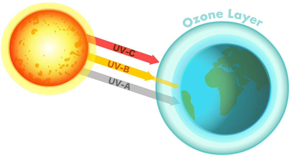
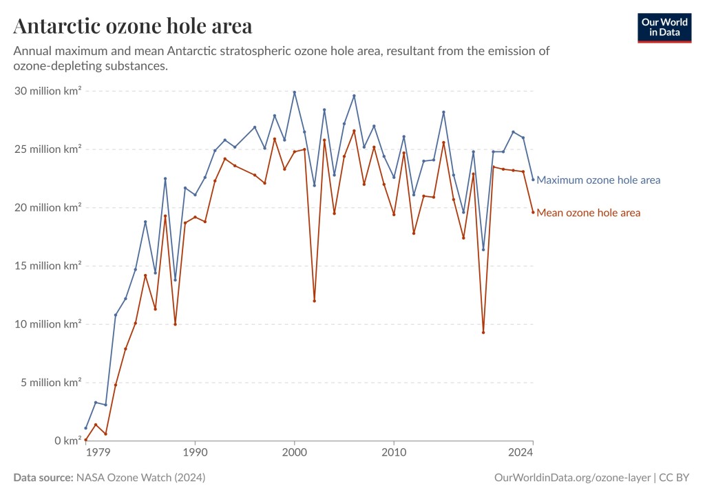
- Emissions of ozone-depleting gases have fallen by 99 Percent. This is a very important one that is saving millions of lives every year (preventing skin cancer).
- Natural Disasters Kill Less People Now Than 100 Years Ago. We have gotten much better at protecting lives in natural disasters and less people die in natural disasters despite the increase in frequency, severity and cost of certain natural disasters.
- EV Cars Indeed Emit Less Carbon Pollution. Due to misinformation spread about EVs this comes as a surprise to many.
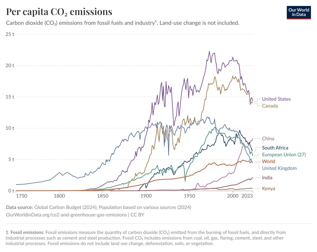
- Developed nations have successfully reduced carbon emissions.